Content
This gallery includes:
1. Generative Art
These are the generative arts that I created with aRtsy. Different from the traditional artworks that feeds on human’s creativity and skills, the generative arts use algorithms as the brush creating artwork that captures the inherent beauty of math and logic.
Function: Shells
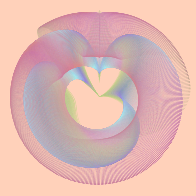 The position of every point
was calculated using the function
\[\begin{align} &x =1.5x_i + cos(x_i) \\ &y =\sqrt{|y_i|} + sin(y_i^2 + x_i^2) \end{align}\]
where (x, y) is the position of generated points. The color of the function are 9 randomly selected complement colors.
Collatz Conjecture: Flame
 This is the collatz
conjecture created with Bucknell’s school color: Blue and Orange.
Langton’s Ant: Error N Terror
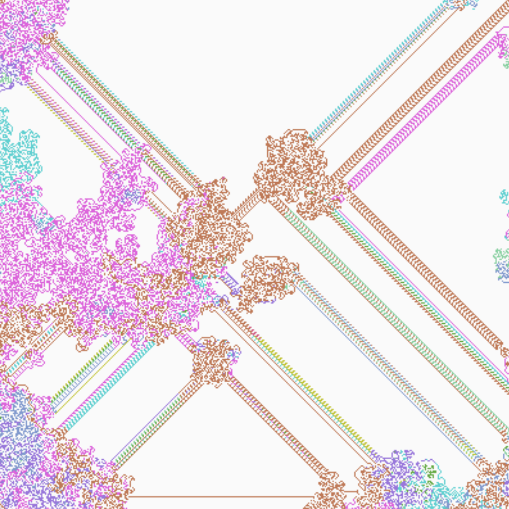 This is a two dimensional
grid colored by the Langton’s
ant, a turing machine that follows a specific set of rules.
2. COVID-19 Heatmap
This section includes the COVID-19 heatmap for worldwide confirmed cases, deaths, and recoveries. The data comes from the Johns Hopkins University’s Coronavirus dataset. I created the animation using the gganimate package.
COVID-19 Cumulative Cases From Jan. 2020 to Oct. 2021
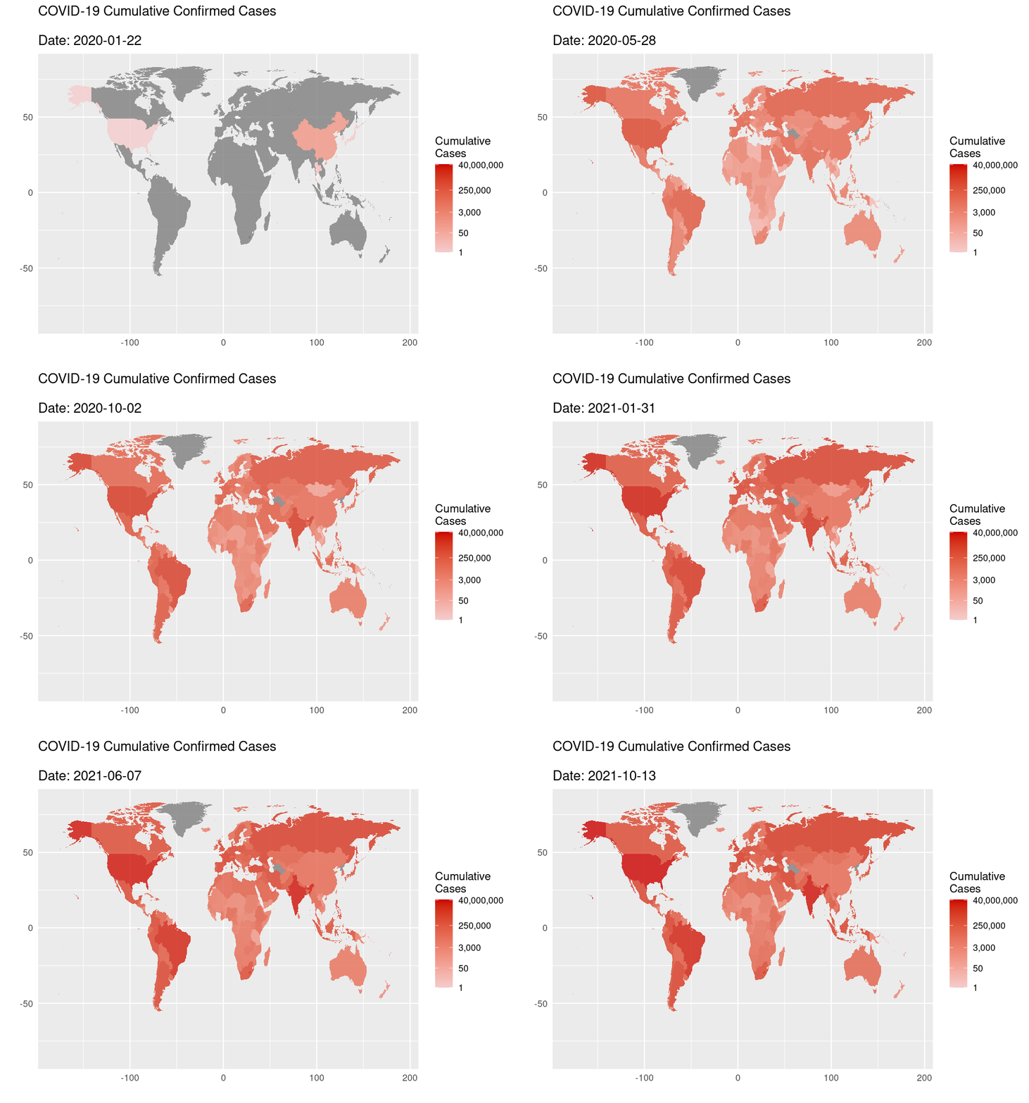
This heatmap shows the cumulative confirmed COVID-19 cases from the Jan. 22, 2020 to Oct. 13, 2021. The map includes the changes in cumulative confirmed cases of 195 regions and countries. I fill the heatmap with the number of cumulative cases. As the animation shows, the cases quickly developed in Jan 2020 and spread to the majoritiy of world around the June 2020. By Oct. 13, 2021, the U.S., Brazil, and India bear the largest cumulative confirmed cases.
I created the heatmap by first subseting the confirmed
cases from the original dataset. I summed the
cases variable on the level of date
and country (which are also the variables of JHU’s
COVID dataset). To get the cumulative cases, I then cumsum
the grouped cases on date, which is also the state of
animation.
Notice that some countries, such as Turkmenistan and North Korea, are not included in this dataset. The unreported countries are colored in grey on this map.
COVID-19 Daily Cases From Jan. 2020 to Oct. 2021
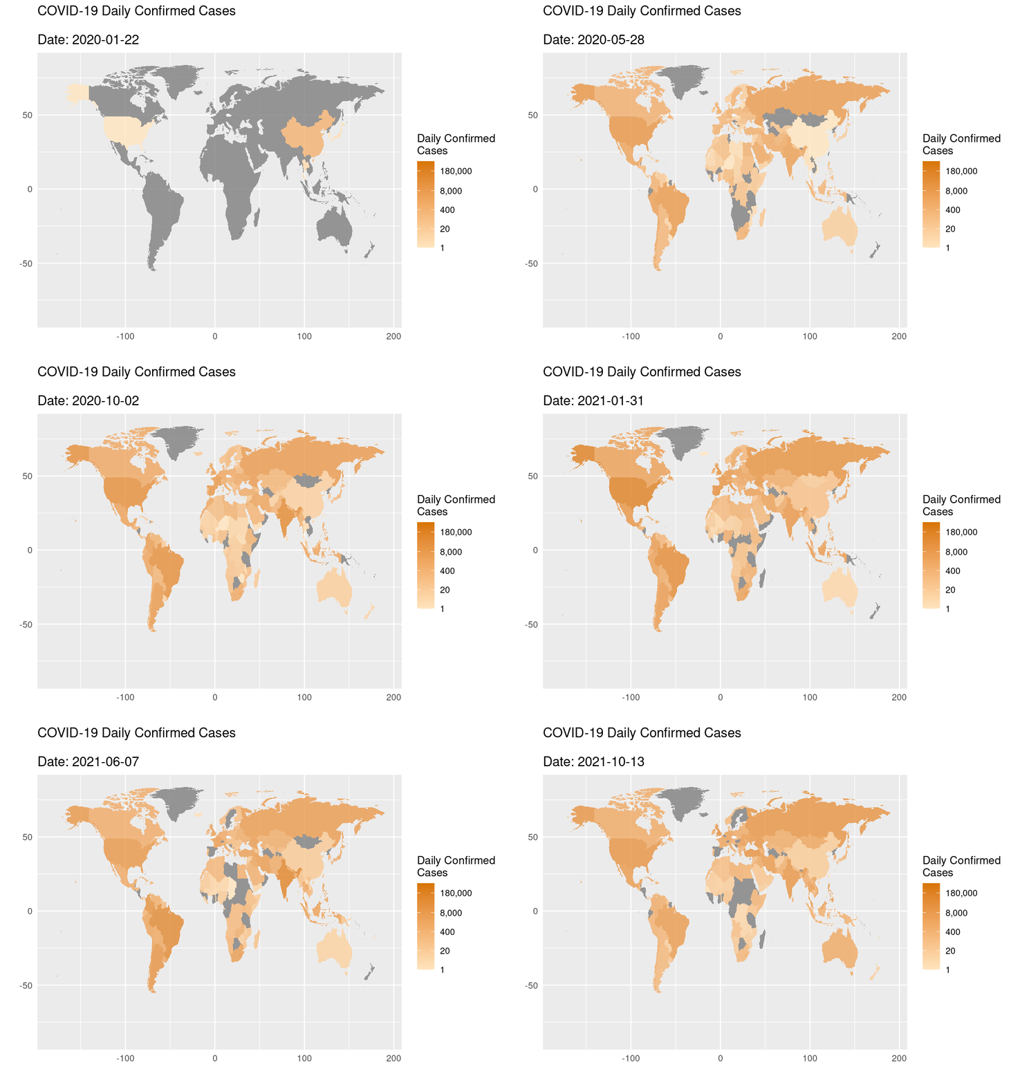 This
heatmap shows the daily confirmed COVID-19 cases from the Jan. 22, 2020
to Oct. 13, 2021. The map includes 195 regions and countries. I fill the
heatmap with the number of daily confirmed cases. Most of the countries
has reported their first COVID-19 cases since the April 2020. China had
the largest number of daily confirmed cases at the beginning of the
pandemic (from Jan 2020 to May 2020), and daily cases in the U.S.,
India, Brazil surged since April 2020.
I created the heatmap by first subseting the confirmed cases from the original dataset. I then summed the cases variable on the level of date and country to get the number of daily cases. The animation transits along the date variable.
Notice that some countries, such as Turkmenistan and North Korea, are not included in this dataset. The unreported countries are colored in grey on this map.
COVID-19 Cumulative Deaths From Jan. 2020 to Oct. 2021
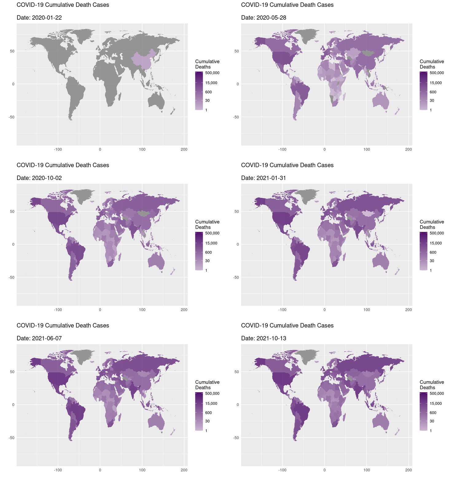
This heatmap shows the cumulative deaths due to COVID-19 infection from the Jan. 22, 2020 to Oct. 13, 2021. The map includes 195 regions and countries. I fill the heatmap with the number of cumulative deaths. The death cases surged in China from Jan. 2020 to May 2020. By the October of 2021, most of the COVID-19 deaths occurred in the U.S., Russia, India, and Brazil.
The heatmap is created with a subset of death cases from the original dataset, following the same procedures for creating the cumulative confirmed cases heatmap.
Notice that some countries, such as Turkmenistan and North Korea, are not included in this dataset. The unreported countries are colored in grey on this map.
COVID-19 Cumulative Recoveries From Jan. 2020 to Oct. 2021
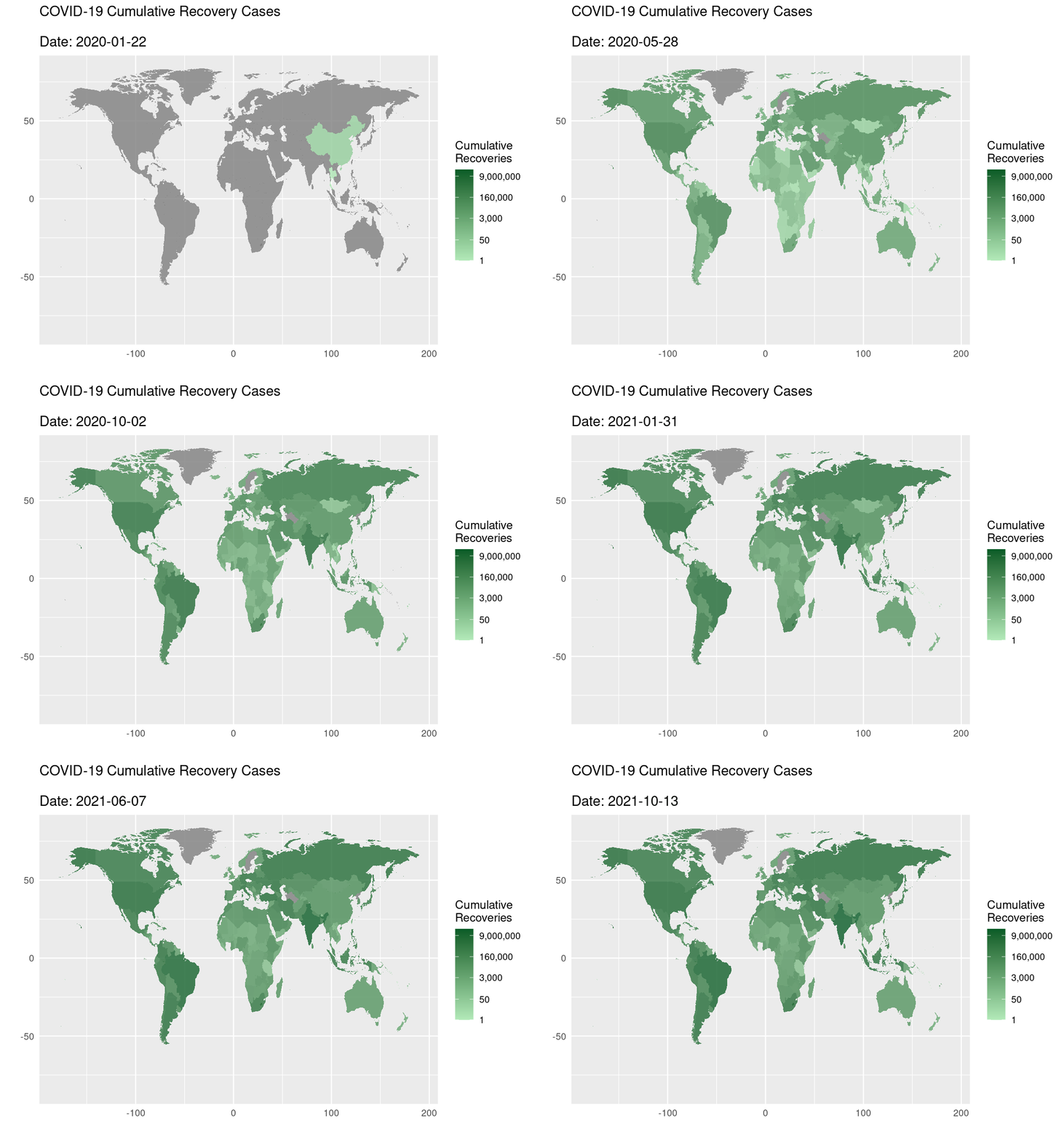 This
heatmap shows the cumulative COVID-19 recoveries from the Jan. 22, 2020
to Oct. 13, 2021. The map includes 195 regions and countries. I fill the
heatmap with the number of cumulative recoveries. By Oct. 13, 2021, most
of the recoveries occurred in the U.S., Russia, India, Brazil, and
Canada.
The heatmap is created with a subset of recovery cases from the original dataset, following the same procedures for creating the cumulative confirmed cases heatmap.
Notice that some countries, such as Turkmenistan and North Korea, are not included in this dataset. The unreported countries are colored in grey on this map.
3. Coursework Visualizations
Challenge of First-Gen College Students
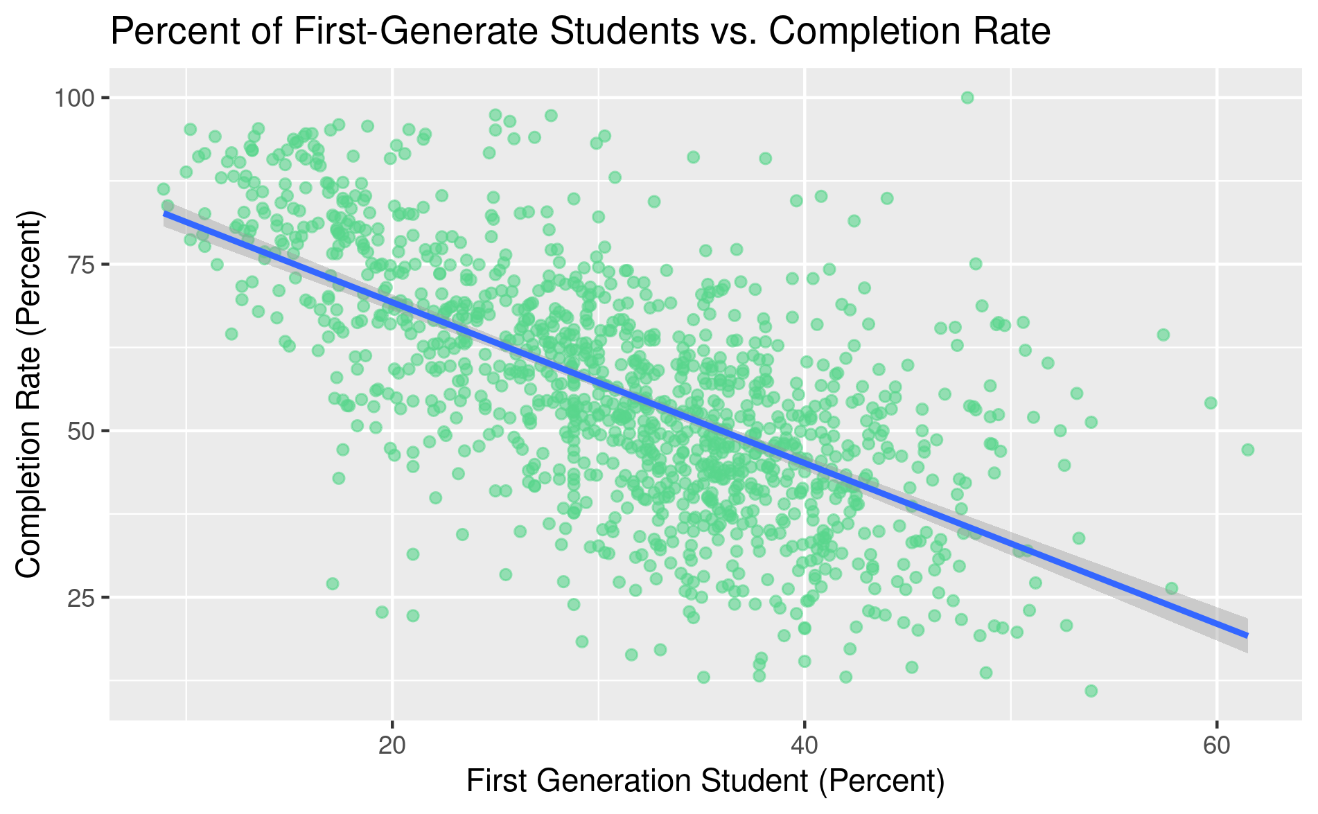 This
scatter plot shows the relationship between the completion rate and
percent of the first-generation student among the U.S. institutions. The
variable on the x-axis is the percent of students who finish their
program within 150% of normal time (completion rate). The variable on
the y-axis is the percent of first generation student at a
institution.
The scatter plot and the trend line show the negative correlation between the number of first-generation student and the institution’s average completion rate, revealing the hardship of first-gen students at the U.S. colleges.
The data used to create this plot come from the CollegeScores dataset of the Lock5Data package.
More Exercise Better metabolism!
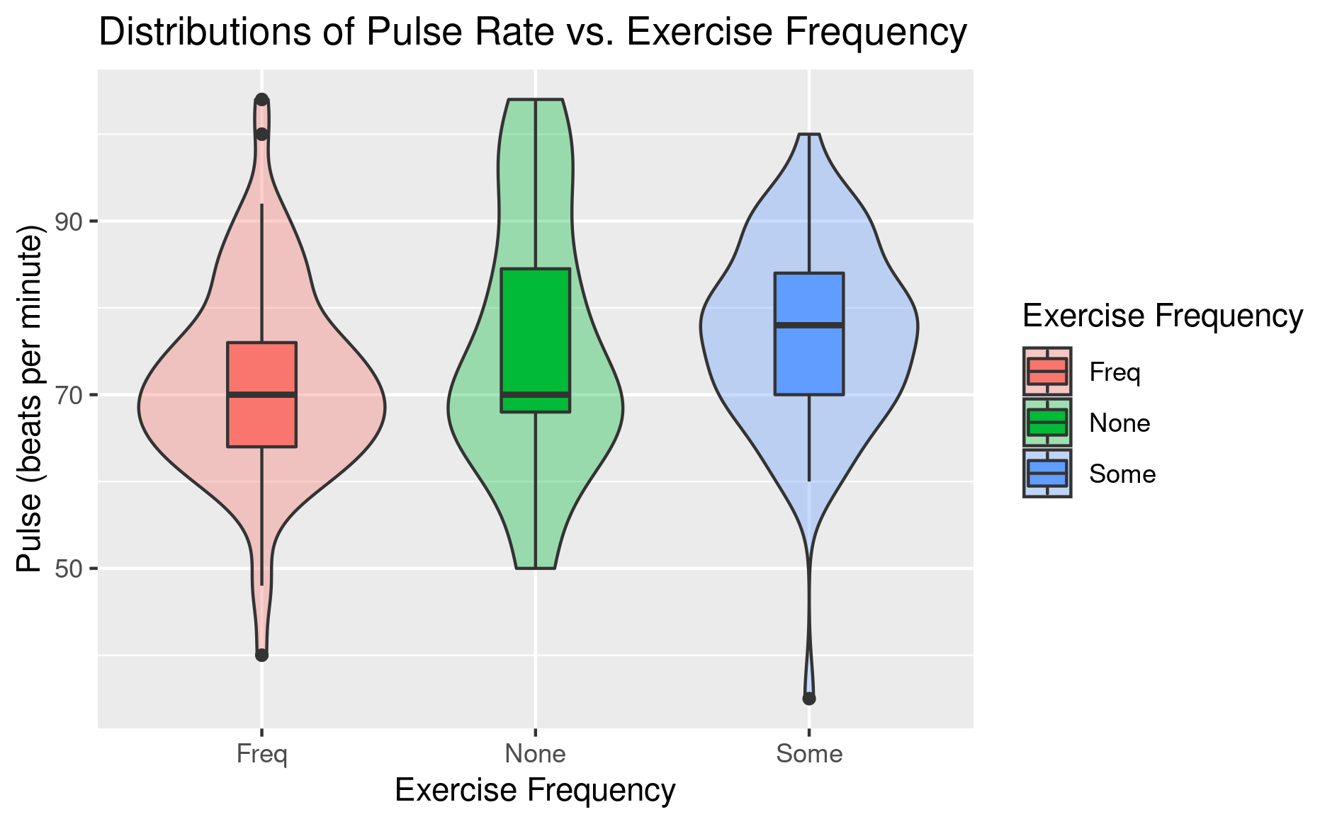
This violin plots overlay with box plots that show the distribution of student’s pulse rate based on their reported exercise frequency. The variable on the x-axis of the plot is how frequent a surveyed student will exercise (none, sometimes, or frequently). The variable on the y-axis of the plot is the pulse rate of the surveyed students.
The plot shows that most students who frequently participate in physical activities will have a lower pulse rate. This finding is expected from a clinical perspective since physical exercise will improve a person’s metabolism, allowing more blood pumped into the circulation within each beat. Thus, the heart won’t need to pump that frequently (lower pulse rate) to sustain the system.
The data used to create this plot come from a subset of the Student Survey Data dataset from Lock5Data package. Only the complete observations are used in creating the plot above.
4. Shiny Web App
I also created an interactive Shiny web app that aims to help the intro-level stats students to understand the confidence level. Below are a screenshot of the application and a static plot that can be created with this app.
Here is the Link to our Shiny App
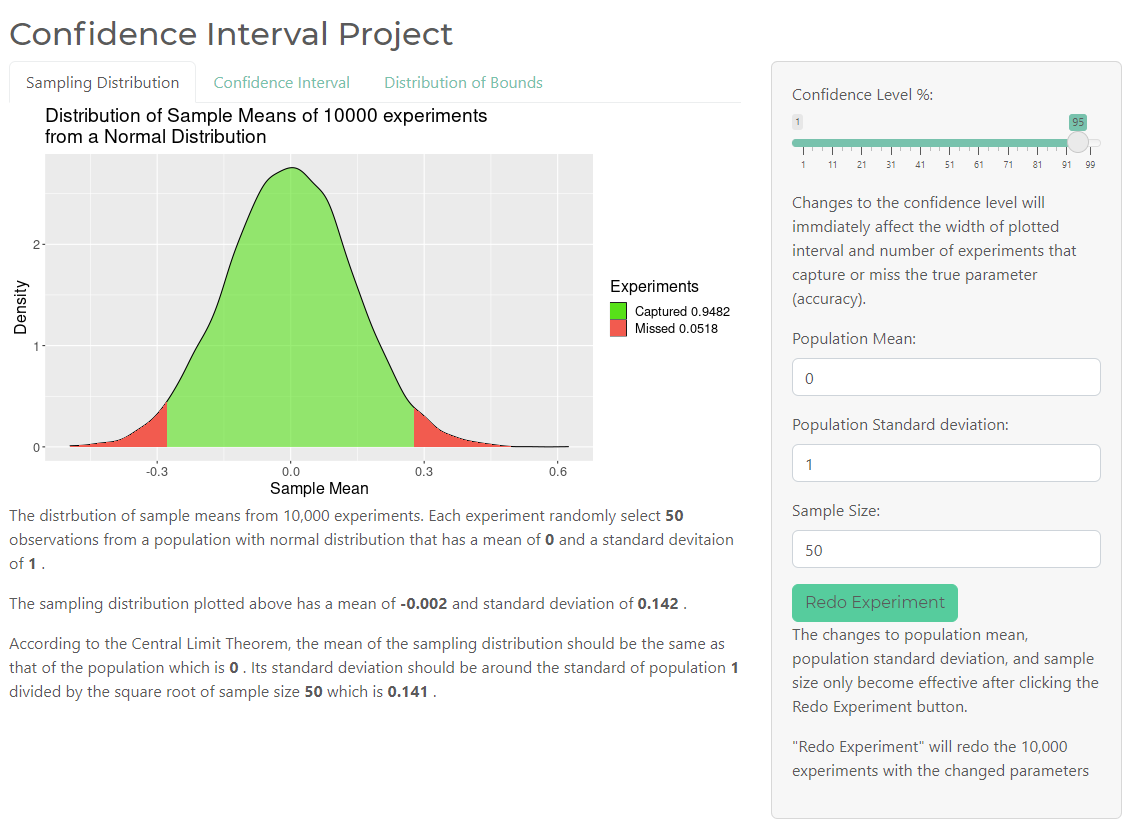 Screenshot of the Shiny App user interface.
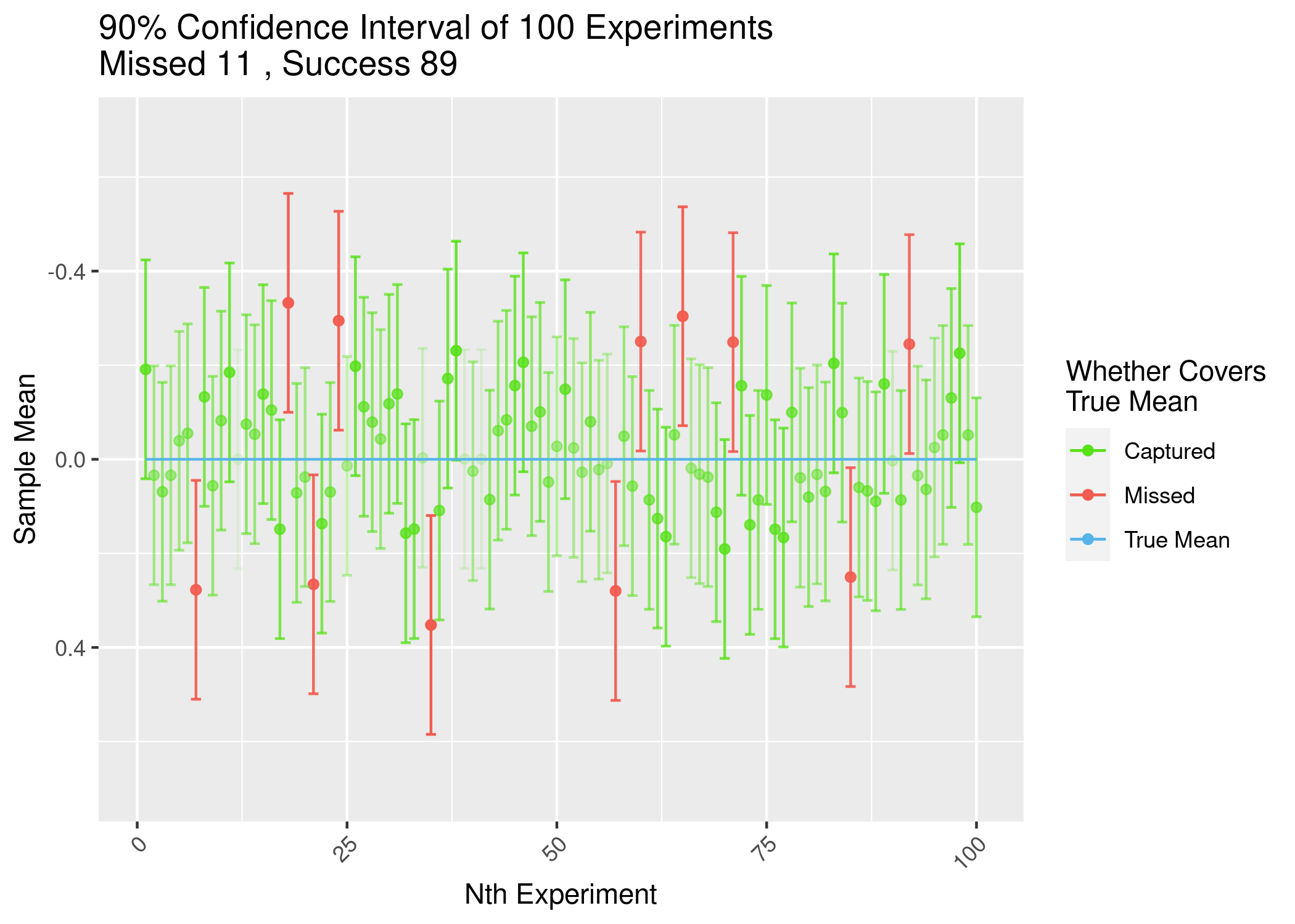 A sample plot that can be created with this application.